What if, for once, I dared to say publicly all the things I don’t like about one of my pieces? And one I love the most. Give you a peak on how gloomy it is within my head, some days and how criticism can be a very narrow prison. It is something one highly needs to improve, but it can become crippling, to the point you’re unable to love your own work. And without that, your motivation becomes brittle.
It is something I often struggle with. Over the last few years, I have learnt that this is something that needs to be dosed. It is like intrusive negative thoughts with depression, if these ways of thinking are given free space, and though at a certain level they are needed to improve, when they’re too strong they really jeopardize your work.
I have no idea of how something like this post could be perceived: would it be something that builds community and shows vulnerability? Or would it just weaken how my potential customers see my work?
This is going to be a long post. Open youtube, spotify, whatever, turn Debussy’s Reverie on, and read.


Concept and inspiration
This dress takes inspiration from one of my favourite Lalique pieces: the snowy pines pendant. There’s two of them, one with a hanging pearl, one without. I have been obsessed with these since I was in high school. We were asked to do a render of the inside of a jewelry store, and the teacher gave each of the fastest students to complete the geometrical part a book with jewels of different style to set in the environment. I was given a very thick catalogue of an art nouveau jewelry exhibit. I was starstruck! I was in love. Art Nouveau to me is the highest point that aesthetics have ever achieved. Baroque is heavy, rococo is too coquettish, romantic is too gloomy and not gloomy enough, then you have other things and suddenly… art nouveau. The love child of a herbarium and a japanese print. Whiplash lines, soft colors chosen with a sense of taste we rarely find in other eras. The crowning glory of an era of prosperity on the edge of such horrors that the world had never seen, not yet spoiled by that cynicism. It is a dream. And it is not by chance that I picked Reverie, daydreaming, as the name for the historical costuming group I founded.
Anyway, I wanted to mimic the way the pendants created a door to a different world. Something so small, so essential, and yet so deliciously calibrated: a glance and you’re in Narnia.
I wanted a dress that gave the suspended feeling of a winter sunset. When you look at the incandescent orange-red sun and everything against it becomes powder blue-grey, the hazy atmosphere ignites with the last rays of light, becoming fluorescent pink. Oh, to capture the power of that palette. It is something I have been aiming to, since I was a child. It was pain, in such days, to realize that moment would have passed and none would have been identical. Drawing, painting and photography have been my anchors for such things, since I have memory. And I have been guided by this concept multiple times, when creating garments. I wanted to make fabric alive with color and texture and lines, to have that feeling and that magic on a hanger, ready to give that emotion back to the viewer upon request, like a candy gives back the taste or a movie gives you a certain emotion, like it is picked from a library. But I digress…
So, how does one turn that feeling into a dress? We need something more… practical.
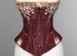
I started with some photos of snowy dawns and I selected a couple. I then chose a rather simple silhouette, from the beginning of the 20th century. My main inspiration was Franca Florio’s black lace (or cutwork?) dress, the one used for one of the versions of the Boldini painting. So no teardrop sleeves, and a trumpet-shaped skirt. I am a bit bustier, so to create a good pigeon bust I needed more volume. At least it was what worked for me for the burgundy Poisoned Apples dress. And here there is a bit of a conundrum: the antique bodices of the era I have do not have that much volume at the front. They have very little. But the paintings, the photographs… I wanted that. The issue is that the low pigeon bust of 1904-1906 does not contemplate very well a medium bust size. If you have little, the curve is built with the amount of fabric, and it’s easy. If you have a lot and you can shape, lower and flatten by a lot, it’s still more doable. The middle thing needs concealing.


My first idea was to take patterns from the Lalique pendants, but there was a problem: I had to paint with one color. I did not have layers of enamel to play with, so how to render the snow? With beadwork. On a walking dress? Not really. So, despite trying over and over and over, I was unable to give that specific feel. Moreover pine trunks are always very vertical. Which creates a weird shape on the skirt, which does not necessarily continue easily on the round shape of the bust. This slowed things down by a lot. Almost two years. Every now and then I did a couple of sketches, never finding something that won me over completely. I came close with a design of coiling barren trees over a cloud of brambles, reflecting over water. But the balance of the skirt was weird, the lack of symmetry also not the most convincing, and the water pattern, being horizontal, would have required a lot of work, compromising stability of the piece.
What happened?


I went on holiday, after Christmas, in the Dolomites, the usual place. My brain was really resting and enjoying the snow. At some point my husband, my dog and I were walking, and… I saw some frozen thistles. The flowers usually grow and bloom during summer, these were all frosty and dry. And so beautiful.

Thistles are usually associated with Scotland, but they are also very present in art nouveau designs. The elongated points of the leaves, the thorns, and the color pairing. Not to mention the variety of shapes. And they represent resilience, as they thrive in less than welcoming surroundings. But I did not care for that. Thistles are the rose’s weird cousin. They have more thorns. They are not seductive as the round scented petals, almost velvety… they are basically porcupines of thorns. With super fancy leaves. And an unparalleled sense of fashion and drama, if you ask me: how dare they sprout in pinks and purples in the most color-barren landscapes? Everything’s muted, delicate, small. And there comes this huge pine-shaped flower that challenges the winds with nothing less than nature’s feather boa. In the most vivid purple. Keep your St. Valentine roses, I want to be a thistle. I don’t want to be seductive and alluring and inviting, and then to have the thorns. I am a spiky thing with an insatiable desire for aesthetic drama.
Materials & Techniques
I wanted to make this dress for a long time. I originally wanted to make it with the laser cutting machine, but it has three order of problems:
- you need 100% pure wool to avoid producing very unhealthy smoke
- it leaves a black edge where it cuts
- you need to work with small panels, and you can not match one frame with the next as you would do with an embroidery machine, keeping one piece of cloth for different sessions.

So, despite the long search for the exact shade, and despite going as far as Paris (I was already there for Fetes Galantes, I did not travel just for that) to get the fabric that the project required… In the end I did not cut it with the laser. I did it with scissors. And yes, it took forever.
So when it comes to materials, it basically is, from the outside in:
- gimp cord
- blue wool cloth
- silk-cotton duchesse satin from Renaissance Fabrics
- tarlatan
- thin beige cotton canvas lining
- boning, tapes, all of that.
I started selecting the corset (made by Dario Princiotta, and it is the same I used for the burgundy Poisoned Apples dress) and doing mock-ups. Once I perfected the pattern, I cut the satin, I basted it to make it match and ombré dyed it. I then cut the lining and the wool in the same shape, and it is at this point that my design doubts started to block the project for almost two years.
So the materials are fairly accurate. The differences from what would have been used at the time are:
- silk-cotton duchesse instead of silk duchesse. The outer look of the fabric is all silk anyway, the shine is there, but the price is more accessible and you have the hand of a thicker-woven fabric than this was;
- The lining is a common sheeting cotton canvas. Rather thin for today standards, but at the time it would have most likely been chintzed/glazed cotton twill. It would not have twisted sideways like twill nowadays, but it would have been lighter in weight;
- I used synthetic gimp. I have some silk gimp gently given to me by Virtuous Courtesan, but it is dark blue and I plan to use it for a project that could never see the light… the one I ended up using, I found in the Dolomites. Very small haberdashery shop. They sell gimp… for crocheting. I am not kidding. It is available. All colors, basically. People make bags out of it. I can’t believe it. But it’s great: now I have a source for it, and I will use it for 18th century trimmings and 19th century details without shame. It is however rayon on a cotton base, so not historically accurate. But nobody will see the difference. I should avoid telling, I know. But I overshare. See the length of this post already?


Construction Process
Uhm. This section would be more properly titled “what happened when the light bulb in my brain finally turned on for the thistles”. But it’s less effective for google things, and makes me less of an authority in posting, apparently, always according to what is good for google search engines.
Anyway, in a sequence worthy of a movie, I got back home, and during the walk back I could only think “thistles thistles thistles thistles!!!”. I had to set the idea on paper. When you are in that fizzing state, you somewhat fear that the idea will fade, if you only dare to place it on the table for an instant. So you can do nothing else but to write it or, in my case, sketch it. Enter one of the ugliest sketches I have ever made. Because the rule on holiday is “no work here, this needs to be your sanctuary to recover, you can not let work infect this place with its pressure and anxiety, otherwise you burn out as fast as a match: you’re recharging”. So I did the sketch, I felt quiet and I rested properly.


When I got home, I started sketching directly on the reverse side of the fabric. I did make a couple of paper sketches first, but the scale and such are things you need to see on the panel. I have a good sense of space in this matter, I know how to balance things in 3d when I see flat elements. There’s room for improvement, but the world of people who make dresses is divided into those who can see the flat elements turning into a 3d piece in their mind, who can see how the 3d alters when you change a flat line. And those who can’t, and rely on processes and rules. I have been doing the 3d thing very well since school.
I pinned the pieces with their other side counterpart, I cut it all with embroidery scissors. Counting only the cutwork panels and not the others with other styles of work like the jabot, the collar closure, the decorative centrepiece and the belt, they’re 13 pieces. Some small. Some neverending, as you can imagine by seeing the stop motion reels on instagram. The lower portion of the skirt was especially time-consuming, because I wanted to add very Mucha-esque medallions, getting smaller in the front. And they took forever. And- mostly- paid off.
I have to say I also did plenty of curved stems for the thistles, because once again vertical lines were not doing my shapes any favour. Hope you won’t mind. I made them dance to the art nouveau theme.
I knew this would have been long, but who knew. I spent at least three whole days basting the wool pieces to the satin, the satin to the tarlatan. Once that was done, to avoid any possibility of twisting (and it was not enough), I machine stitched along the edges. And before you ask, there are some examples of machine topstitching at the time, exactly in cutwork pieces with wool, not intended to be worn inside the house. I only dared to do that after seeing an example.
The machine stitching took another three working days.

Anyway, after the machine stitching, came the gimp. And here I cheated. Because it was supposed to be hand-sewn. And it was either that or probably waiting two more years. So I used a very small zigzag with a matching thread. It is not historically accurate, it is dreadfully visible- to me at least- but it made things work.
Here using natural fibres came extremely in handy: polyester and synthetics do not take shapes with heat that well. Using silk, cotton and wool allowed me to flatten the pieces perfectly before adding the gimp. And of course I checked that after stitching all these appliques and cords with the lowest possible tension, the piece kept the same shape, width and length of the matching lining. Because yes, if you do not know that, pieces shrink. Was it enough? No! Because since I started the project and did the toile, two years had passed. I dared go to the gym. I underestimated things and ended up with something too narrow on the back. This was how I found out I got a couple of extra centimeters of shoulder muscles. Sigh. Now I need to pad my not-trustworthy-anymore lifecast mannequin.
Then I assembled and finished the pieces. Did the hems, added cords, facings, bindings, hooks. Decided to do the cravat with the pleating machine I finally got. It looked nice-ish. I could not find the piece of silk chiffon. Refused to buy more. Used georgette instead, because it was sheer and silk and at hand. Regrets. The thing is- of course- stretchy by design, so pleats are not a thing. It was foggy the day of the walk. The pleats latest about ten minutes. Also because the machine was not nearly as hot as it needed to be. But husband refuses to let me use the oven. Why? Don’t you aim to die because of the chemicals oozed by a piece going back when arsenic and radium were all the rage? No? That’s a missed chance of experiencing real history there!
The piece was barely finished on time (I am improving on this, I swear, I only do one new dress for carnevale every year). Which means the front closure was stitched on the night before and the piece was pinned on, in more than a couple of places.
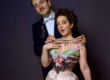
I think it looked striking, gorgeous, and I am proud of all that work that went into it. I am especially proud of the design. And of the purple feather on the vintage fur hat, that echoes the fresh thistle flowers. I guess not many noticed, but now you know. These little things make me feel clever. Pat-pat.


Let perfectionism do its thing…
This is hard. Very hard to write.
Let’s start by the mismatched color at the centre front on the bodice. The satin, despite dyeing basted, came out different. One side is as yellow as it was supposed to be, the other is already pink. When they were wet, it was not visible. When it dried… I don’t know. They clearly were different already, but it was way less visible when the pieces were darker and wet. Or was I just tired? If it was for somebody else, I would have done it again. But it was for me, and at some point I thought that some asymmetry would have looked more organic. Like the sun coming up from the east. And the variation was very slow with the gradient. When I placed the cutwork on… it enhanced it. And it was too late.
Then we have the collar. When I applied the extra piece at the centre back (it was supposed to be there to cover the seam already, I just made it wider to accommodate my brand new muscles) of course the top slightly separated, messing up the neckline. So the collar does not sit very neatly. And I need someone else to pin it on. I wanted it to be very snug and like a vase. It is not precise. And mostly not how I wanted it. I may redo it. Or not. Or invent something else. I would very much like more room to move the shoulders, and close my own collar. I always make sure my customers can bring their hands to the face, to eat and drink. I sometimes do sleeves where they can even do their own hair, if the era allows. But here we say that it’s the cobbler, the one who walks around in broken shoes.


Of the cravat we already spoke. So there’s the shape of the pigeon bust. I think I overdid it. I need less fabric on the side and less padding. But mostly, I need to use a different corset underneath, and only once i have the base, I will be able to see if I need more or less padding, and placed where. I may even take apart the collar, the too-yellow panel, redo the first and lightly spray with diluted pink the back of the mismatched side.
The corset I chose works beautifully for the burgundy dress and for later models. In Lucile’s sketches of the era, you see very narrow hips. However the original mine wants to aim for, has a different hip spring. So I want to try with a different corset. And finish the skirt on the shape I like.
And now the skirt. Imagine me taking a deep breath.
I assembled the front appliqué by hand, in Venice. We did not have an ironing board where to keep the piece flat. I did my best, but it was not enough. I did not have the space to baste it properly. So at the front you get all those unpleasant wrinkles where the top and bottom panel join. That can and will be fixed.
Then there is the length. Too long. Easily fixed, but first I need the new hip shape. Then I did not have the time to add appliques to conceal the seam on the top and bottom panels. I drafted four, but never came up with one I like.

Then we have the weight. Despite adding not one, but two layers of tarlatane (next time I will make my own with cheesecloth and gelatine, so I will be sure it will be FIRM as hard tulle, and not just mildly crisp), the back is heavy. And by heavy I mean that it does not move, open or alter. It slides on the floor like a snail. Despite the cording, despite the reinforcement at the hem, the topstitching that gives structure and a petticoat with a bit of train made exactly for these skirts. On this subject, I think I will need to meditate when seeing how the skirt behaves when it will be shorter. And possibly not wet with venetian mud. Gosh, how long it took to be cleaned and sanitized.
What else? I am sure I will find other things. Especially on the hair and hat. But I think it’s enough already for one article.
And now what?
Well, some of you may have noticed the mistakes, some won’t have seen them until just now. I think they can be reassuring in two ways: even pretty things can be not-perfect, and it’s a safety net.
How so? Well, on my own work I work with different standards. When I work for others, I prioritize safety and reliability, I move on safe and known ground. On my pieces I dare and risk. The pieces I make for myself are not as well balanced, they’re pieces that need to showcase my creativity and what can be achieved. I can then repeat them without making those same mistakes, for others.
Does this mean commissioned work is perfect? It’s not possible. Not for me, at least. But I hope it moves your heart, it makes you dream, it makes you feel different when you wear it. It is sewn with my time, my passion, my art in it, you’re wearing a piece of someone else’s life. It is something I have cared for, deeply. And I hope this somehow comes back to the wearer. I hope it will translate into memories of incredible events and experiences. That is what I sell, after all. I don’t do haute couture, it is simply not my goal.


Your girl has also found out she completely missed the center gimpwork on one of the front skirt thistles. Two days after publishing this. Let’s call it an extra reason to take the skirt apart and imrpove.
Oh, well. Despite all of this, I think I can pat myself on the shoulder. I like the dress, it looks beautiful, despite the improvable things. And it does show where the strength of my work lies: taste and design.
You can see the available projects you can get made on your measurements HERE.
Liked this post? Want to support my work in other ways or let me know your thoughts? Comments here and on social media are appreciated!