The spark for this design came while travelling through the Loire Valley châteaux. It is the usual: you leave at home the burden of work and bureaucracy, and suddenly your head starts gushing ideas like it was a baroque fountain.
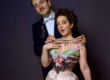
While visiting the Château de Chenonceau, my attention was brought to one historical figure that almost passes unnoticed, when all you hear is “Diane de Poitiers and Caterina De’ Medici”. It is Louise of Lorraine, widow of Henry III of France. After her husband’s assassination in 1589, at the close of the French Wars of Religion, she withdrew from court and secluded herself in the castle, where she lived until her death in 1601. Doesn’t it sound like a fairytale already?

Well, the thing is… she had a taste for the dramatic. And that is what ignited my brain to a creative fury I had not felt in a while.
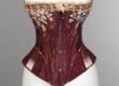
Her apartments were repainted in black and treated as a continuous space dedicated to mourning. The surfaces were covered with a dense iconographic: tears, cords, thorns, skeletal references, gravedigger’s spades. Something I had never seen before. I had seen tombs, and mausoleums, weeping angels and chandeliers made of bones. But this? And what is more striking, is that I came from a world of flame-resistant and whippet-looking salamanders, porcupines, heads of Helios- god of the sun- and bees. I was not prepared to be thrown into that goth girl galore*.
Image on the side by this website
*Despite wearing all colors now, I still consider myself a goth girl. I spent my fair share of years wearing only black and keeping boots on even in Italian July.

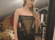
My love for costume and cinema brought me to find that some purples and muted pinks can make you look like a vampire even more than black, and that when you put a lot of work and time and money and effort in a piece of clothing, the details barely show when it is all black. So here you have a colorful goth.
Mourning in Black and White
We tend to read black as the historical colour of mourning, but when we go back just a century, we find that white has long been on black’s side. Now just in collars and pearls and diamonds, but the further back you go, the more you have people dressed entirely in white, especially children. White was, in fact, used to express grief way before it was used to indicate the bride’s purity. And not only in European cultures.
Louise’s choice of black aligns with a severe, interiorised form of widowhood, one that withdraws and condenses. In contrast, Diane de Poitiers, who had earlier inhabited Chenonceau, famously adopted a palette of black and white after the death of her husband. In her case, the pairing becomes almost heraldic: high contrast, controlled, public, inseparable from her identity and her emblems, including the crescent moon. White, in this context, is not absence: it carries associations with ritual purity, with the body disciplined into virtue, with a kind of visibility that is both constructed and symbolic. Black, on the other hand, absorbs and constraints. Black is a void that swallows, ink that touches everything you come by, including all your world in your pain.

From historical iconography to contemporary
Let’s start by saying that the pearls are something I added. They were not part of the specific iconography found in Louise of Lorraine’s rooms. They are however deeply linked to tears and that idea of purity, so I wanted to introduce them deliberately, drawing on 19th-century mourning imagery. Bringing them into the composition creates a bridge between periods, making the strict lines of the original designs more adaptable to my drawing style and aesthetic.
At this point the meaning kind of shifted, and though it started as something merely decorative with a gothic vibe, it became something else.

White, from a costuming perspective, is a nightmare. It gets stained by everything you touch. This is why it was expensive, this is why it is a symbol of purity. But it is a very constrictive home to inhabit. And the duality of black and white suddenly connected to the frame of the “virgin-whore” complex. There was the funeral I wanted to celebrate. Of the whole narrow space system, of the frames we- as women- are forced into, the only spaces where we become readable by society. Hence the third term: the virgin dies, the whore (symbol of choice over our own bodies) is celebrated, the witch thrives.
Around these elements, I built a dense composition in black and white, closer to an overworked heraldic device than to a clean, modern motif. It is intentionally excessive, as the message is one that has been repressed so long in our world that it needs screaming.
I had fun picking anatomical elements and representing them accurately (oh, a degree in physiotherapy is useful, in the end, who would have guessed?). It gave me a very specific kind of control over the forms, and I used that in a slightly irreverent way: the baroque bow placed beneath the skull echoes the structure of the pelvic bones, the exact element that defines a woman to the eyes of our society is hidden in an optical illusion. And I could write at length over that, over once again the element of choice, of identification, of choosing not to become a vessel of that function… but maybe it’s already too much. And for those who are used to me not being explicitly political on social media, seeing how much I am may be a bit shocking.
Anyway, I began with pencil sketches while travelling, and that very lucky drawing became the little changed base for the digital version. The final linework uses hatching that deliberately sits between two references: early printed engravings and tattoo work. Both rely on line as structure, and both carry a sense of permanence.
Language, Motto, and Feminist Position
On the ribbons you can find the phrase:
“La vierge est morte, vive la putaine sorcière.”
The choice of French points back to the geographical and cultural origin of the references, but also echoes the tradition of mottos in noble heraldry, where French and Latin are used to condense identity into a formula. The structure itself recalls proclamations of succession in monarchy, where death has very little time, as it is announced paired with the beginning of the new era. Here the virgin is ended by the person who was forced to embody that ideal. There is no nod to bachelorette party’s iconography here.
What follows is not a simple inversion: the “witch” is not a caricature, but a figure tied to knowledge, autonomy, and historically persecuted forms of female agency. The phrase claims space for choice over one’s own body, over one’s own identity, outside the narrow roles that are still, in many contexts, considered acceptable.
This position is intentional and inclusive. And of course, I hope my trans sisters will feel represented in this too.
Louise of Lorraine constructed a space in which to inhabit grief, and we’ll never know her position on this reading. I do not claim, in any way, that this new meaning is something tied to her. I took the words of the language she used, to express what my own soul suggested.


Practicalities: Scale, Pattern, and Use
The design is built as a repeat, and in most examples at a large scale. The text is set in a Gothic font and needs room to remain legible, which affects how the pattern behaves across different surfaces.
It lends itself particularly well to:
- large textile applications such as bed linen and coverlets
- wallpaper
- statement garments, where scale can be preserved
On smaller objects, the current limitations of the platform mean the design may appear cropped or off-centre. I have no power over it: resizing and uploading as a different design would probably create a confused page for the potential customer, and lack of immediate clarity means no sales.


Where to Find it
The design is available via Spoonflower.
You can access the full collection, including colour variations and different scales HERE.
Multiple versions are available in different colourways and sizes, with the intention of making the work adaptable for both those who sew and design their own garments, and for those who prefer finished objects.
AI Disclaimer
Within the profile, you will find earlier visual experiments created with Midjourney. I have grouped them under a specific collection. Though those will remain available, all new designs, including the Sublime Moon ones, have been developed without the use of generative image tools. Future designs will not involve generative image tools.
Making these images took a lot of time. Here they are uploaded cropped or in lower resolution than the originals. Any use without consent is not permitted. If you wish to use any, please email me using the contact references on this website.